Sign Smarts
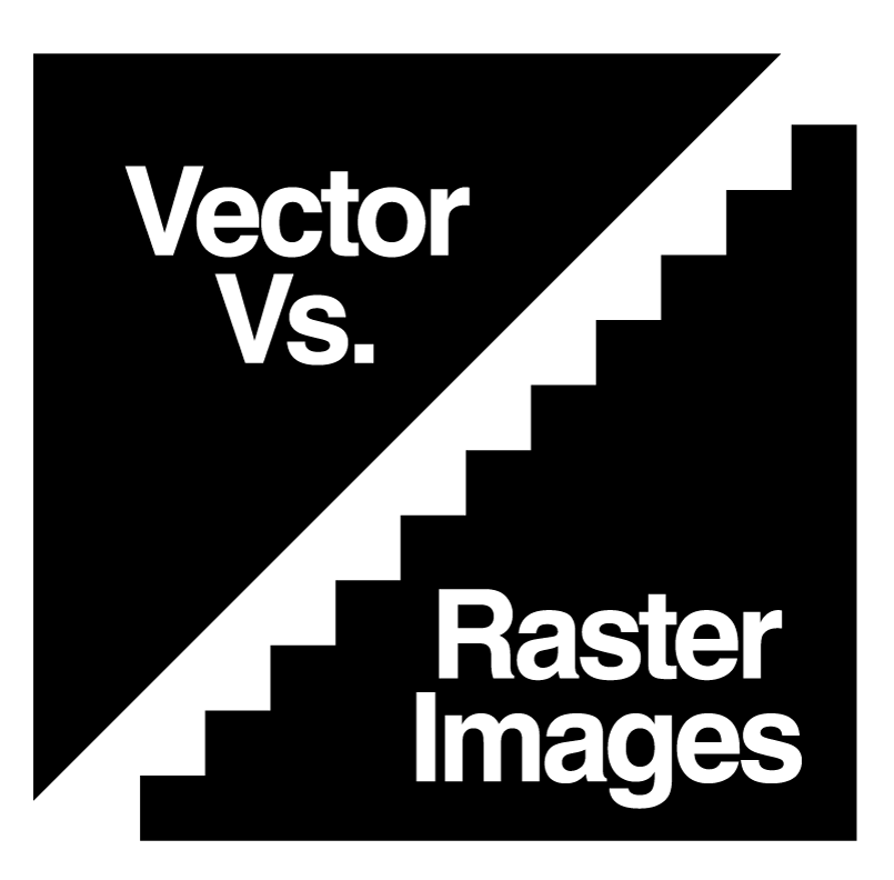
Vector Vs. Raster Art
You may have heard the terms vector or raster art if you have gone to a professional printer, sign maker or other professional graphics service. It can be confusing if you don’t deal with art files on a regular basis. Not all art is created equally and will not work for all applications. This blog post will give you some insight and describe why it does make a difference which type you have when it comes to producing your art.
What is the difference?
Raster art is created from taking a single block or pixel. When hundreds, thousands or more of these blocks are put side by side in a grid it can create an image. Think Lego bocks but on a smaller scale. Digital cameras create images this way. Millions of pixels (megapixel) of varying colors on a grid create the image. Vector art is built using paths and nodes. Go back to your time in Algebra class. When using a grid you would put points on a graph and draw lines between them. The points are the nodes and the lines are the paths (Figure 1). Vector art is created the same way. Points are connected and filled with color. It sounds simple but vector art has gotten very complex and near photo realistic art can now be created using vector images. The catch is that it must be drawn and cannot be captured with the snap of a camera. There are programs out there that can autotrace images where the computer goes in and redraws the image. These images are far from perfect and often times the computer redraws don’t match what the image was intended to look like and have small random spots of colors that don’t work well to reproduce.

(Figure 1)
Why should I care? They both look great on my screen.
Very true but the problem comes when putting ink on paper or other substrates. Often times especially when images are taken from websites they are raster and only have enough pixels to look good on screen. When they are enlarged to work for your project the edges of those pixels become larger and much more noticeable. We often refer to this as pixelization. If we go back to the Lego block reference it is like looking at a large wall of Legos creating an image from a hundred feet away (figure 2) but when we enlarge it or walk closer to say five feet away (figure 3) the edges of the blocks that are different colors from one another are far more noticeable. This is why many professional printers prefer vector art.

(Figure 2)

(Figure 3)
When vector art is enlarged the nodes and paths are adjusted mathematically to keep the curves and edges just as sharp as when the image is small. Elements in vector art is far easier to be adjusted this way as well. Single parts of the image can be recolored or removed without disturbing the rest of the image. Because of these reasons vector art is the preferred art to have for logos. Raster art does still have the edge when it comes to photos. As was stated earlier vector art can create near realistic images but it is not a perfect method and costly to create.
Read Other Blog Posts
Read Archived Posts